
OnlineOrNot Diaries 5

Max Rozen (@RozenMD) / March 24, 2023
Another Friday evening here in Toulouse, let's go into how OnlineOrNot went this week.
This week was a marketing week, and I spent it writing landing pages focusing on telling folks what OnlineOrNot actually does.
There are two types of marketing I care about:
- Marketing that brings in more traffic (typically via blog posts)
- Marketing that improves the likelihood folks will try OnlineOrNot once they've landed on the website
The first type is extremely difficult to influence (but what I often spend my marketing week doing, because the dopamine rush of succeeding is so good, I guess). Think months of consistent output before you start to get the numbers building up, apart from the rare popular article making the front page of Hacker News.
The second type is a lot easier to influence: you already have their attention (however little it might be these days), all you need to do is tell them what you do in 0.1 seconds, easy.
Doubling my conversion rate without really trying
OnlineOrNot's funnel is pretty simple while I'm still trying to optimize my landing pages: from every landing page, every call to action (CTA) on that page takes you to the pricing page. From there, folks either bounce, or sign up.
By doing this, you get to test two things: how effective your landing page copy is, and how effective your pricing page is.
This week I tested a few changes (because I did them all at once, I have no idea which one made all the difference, but there was a lot to fix) which doubled the number of people that ended up on my pricing page.
Just above the fold, here's what I changed:
- Updated tagline from "We detect incidents before your customers do" to "Uptime monitoring in 30 seconds"
- Before this week, you couldn't tell what OnlineOrNot actually did from the main landing page, the tagline was trying to be too clever. This resulted in a large number of bounces.
- Updated every CTA to say "See Pricing ->" instead of "See Plans and Pricing ->"
- Updated the explainer text under the first CTA from "No time limit, and no credit card required." to "Get started on the free tier, no credit card required."
- Folks regularly ask if OnlineOrNot has a free tier despite having one from the start, so here's hoping this helps
- Added a screenshot of the actual product
By the end of the week, twice as many people were visiting my pricing page having landed on my main landing page than a regular week.
Telling potential customers what we actually do
The trouble with having a single landing page, is that you dilute your message by trying to talk to too many people at the same time.
On the OnlineOrNot landing page, I was trying to tell folks that we support: API Monitoring, Browser Checks, Website Monitoring, Status Pages all in a single page, while being brief.
I'd have people emailing me to ask if I supported Slack alerts, when it was the second feature I built for OnlineOrNot.
To fix this I added a new dropdown menu in the header for desktop users, linking them to each individual landing page I built this week:
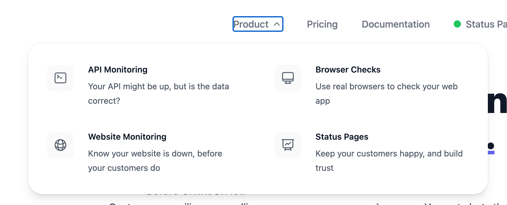
Each individual landing page then explains what we do (with a focus on the type of user that would use that part of the product). Going forward, I'll be writing individual pages for every feature OnlineOrNot has too.